
Overview
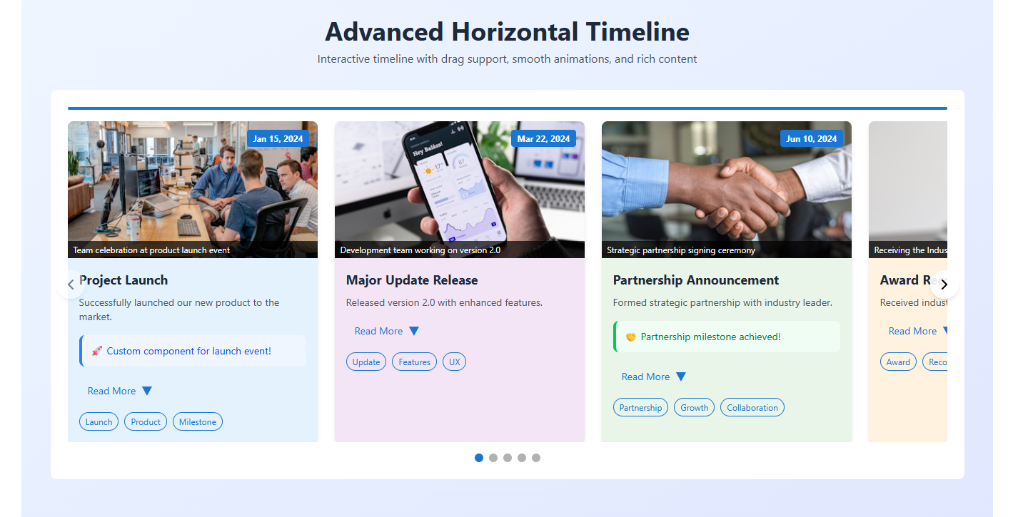
The Advanced Horizontal Timeline Component is a powerful, interactive React component that displays events in a beautiful horizontal timeline format. It features smooth animations, drag-and-drop functionality, customizable styling, and rich content support including images, descriptions, tags, and custom components.
Features
- 🎯 Interactive Navigation: Arrow buttons, bullet navigation, and drag-and-drop support
- 📱 Responsive Design: Works seamlessly on desktop and mobile devices
- 🎨 Customizable Styling: Configurable colors, dimensions, and layouts
- 🖼️ Rich Media Support: Images with zoom effects, captions, and alt text
- 📝 Flexible Content: Short descriptions, expandable full descriptions, and tags
- 🧩 Custom Components: Embed custom React components within timeline cards
- ⚡ Smooth Animations: CSS transitions and hover effects
- ♿ Accessibility: Keyboard navigation and screen reader support
Installation
npm install lucide-react
Copy the HorizontalTimeline component code into your project and import it where needed.
Basic Usage
import HorizontalTimeline from './components/HorizontalTimeline';

const events = [
  {
    dateTime: '2024-01-15T10:00:00Z',
    title: 'Project Launch',
    shortDescription: 'Successfully launched our new product.',
    description: 'Detailed description of the launch event...',
    image: 'https://example.com/image.jpg',
    imageAlt: 'Product launch event',
    imageCaption: 'Team celebrating the launch',
    tags: ['Launch', 'Product', 'Milestone'],
    backgroundColor: '#e3f2fd'
  }
];

function App() {
  return (
    <HorizontalTimeline
      events={events}
      cardWidth={350}
      cardHeight={400}
      showBullets={true}
      showArrows={true}
      dragEnabled={true}
    />
  );
}
Props API
Component Props
| Prop | Type | Default | Description |
|---|---|---|---|
events | Array | [] | Array of event objects (see Event Object Structure) |
cardWidth | number | 320 | Width of each timeline card in pixels |
cardHeight | number | 400 | Minimum height of each timeline card in pixels |
spacing | number | 20 | Space between timeline cards in pixels |
showBullets | boolean | true | Show bullet navigation at the bottom |
showArrows | boolean | true | Show left/right arrow navigation buttons |
autoPlay | boolean | false | Enable automatic timeline progression |
autoPlayInterval | number | 3000 | Auto-play interval in milliseconds |
dragEnabled | boolean | true | Enable drag-and-drop timeline navigation |
backgroundColor | string | '#f5f5f5' | Background color of the timeline container |
accentColor | string | '#1976d2' | Primary accent color for UI elements |
customComponents | object | {} | Custom React components for specific events |
Event Object Structure
Each event in the events array should have the following structure:
{
  // Required fields
  dateTime: '2024-01-15T10:00:00Z',    // ISO 8601 date string
  title: 'Event Title',                 // Event title

  // Optional fields
  shortDescription: 'Brief summary...',  // Short description shown by default
  description: 'Full description...',   // Full description shown when expanded
  image: 'https://example.com/img.jpg', // Image URL
  imageAlt: 'Image description',        // Alt text for accessibility
  imageCaption: 'Image caption',        // Caption displayed over image
  tags: ['Tag1', 'Tag2', 'Tag3'],      // Array of tags
  backgroundColor: '#e3f2fd'            // Custom background color for this card
}
Advanced Configuration
Custom Components
You can embed custom React components within timeline cards using the customComponents prop:
const customComponents = {
  0: <CustomChart data={chartData} />,
  2: <VideoPlayer src="video.mp4" />,
  4: <InteractiveMap coordinates={coords} />
};

<HorizontalTimeline
  events={events}
  customComponents={customComponents}
/>
Styling Customization
The component uses Tailwind CSS classes and inline styles. You can customize the appearance by:
- Using props: Configure
backgroundColor,accentColor,cardWidth, etc. - CSS overrides: Target specific classes in your CSS
- Custom themes: Create theme objects and apply them programmatically
// Theme example
const darkTheme = {
  backgroundColor: '#1f2937',
  accentColor: '#60a5fa',
  cardBackgroundColor: '#374151'
};

<HorizontalTimeline
  events={events}
  backgroundColor={darkTheme.backgroundColor}
  accentColor={darkTheme.accentColor}
/>
Event Handling
The component handles various user interactions automatically:
- Click Navigation: Arrow buttons and bullet navigation
- Drag Navigation: Mouse and touch drag support
- Keyboard Navigation: Arrow keys for accessibility
- Expand/Collapse: Toggle detailed descriptions
- Auto-play: Automatic progression through events
Responsive Design
The timeline automatically adapts to different screen sizes:
- Desktop: Full-width cards with hover effects
- Tablet: Adjusted card spacing and touch-friendly controls
- Mobile: Optimized for touch interactions and smaller screens
Performance Optimization
The component includes several performance optimizations:
- Efficient re-rendering: Uses React.memo and optimized state updates
- Smooth animations: CSS transitions instead of JavaScript animations
- Lazy loading: Images are loaded only when visible
- Event delegation: Optimized event handling for touch and mouse events
Accessibility Features
The component follows accessibility best practices:
- Keyboard Navigation: Full keyboard support for all interactions
- Screen Reader Support: Proper ARIA labels and semantic HTML
- Focus Management: Logical tab order and visible focus indicators
- Alt Text: Required alt text for all images
- Color Contrast: Configurable colors for accessibility compliance
Browser Support
The component supports all modern browsers:
- Chrome 60+
- Firefox 55+
- Safari 12+
- Edge 79+
- iOS Safari 12+
- Android Chrome 60+
Examples
Basic Timeline
const events = [
  {
    dateTime: '2024-01-01T00:00:00Z',
    title: 'New Year',
    shortDescription: 'Start of a new year'
  },
  {
    dateTime: '2024-06-15T12:00:00Z',
    title: 'Mid-Year Review',
    shortDescription: 'Halfway through the year'
  }
];

<HorizontalTimeline events={events} />
Timeline with Images and Tags
const events = [
  {
    dateTime: '2024-03-15T10:00:00Z',
    title: 'Product Launch',
    shortDescription: 'Released version 2.0',
    description: 'Major update with new features...',
    image: 'https://example.com/product.jpg',
    imageAlt: 'Product screenshot',
    imageCaption: 'New user interface',
    tags: ['Product', 'Launch', 'V2.0'],
    backgroundColor: '#f0f9ff'
  }
];

<HorizontalTimeline
  events={events}
  accentColor="#0ea5e9"
  showBullets={true}
  dragEnabled={true}
/>
Auto-playing Timeline
<HorizontalTimeline
  events={events}
  autoPlay={true}
  autoPlayInterval={4000}
  showArrows={false}
/>
Custom Styled Timeline
<HorizontalTimeline
  events={events}
  cardWidth={400}
  cardHeight={500}
  spacing={30}
  backgroundColor="#1e293b"
  accentColor="#f59e0b"
  customComponents={{
    0: <WelcomeMessage />,
    2: <ContactForm />
  }}
/>
Troubleshooting
Common Issues
- Images not loading: Check image URLs and CORS settings
- Drag not working: Ensure
dragEnabledis set totrue - Styling conflicts: Check for CSS conflicts with existing styles
- Performance issues: Optimize images and reduce the number of events
Debug Mode
Enable debug mode by adding this prop:
<HorizontalTimeline
  events={events}
  debug={true}  // Shows additional console logs
/>
Best Practices
- Image Optimization: Use optimized images (WebP format recommended)
- Content Length: Keep descriptions concise for better UX
- Accessibility: Always provide alt text for images
- Performance: Limit the number of events for better performance
- Mobile Testing: Test on various mobile devices and orientations
Migration Guide
If you’re upgrading from a previous version:
- Update import statements
- Check prop name changes
- Update event object structure
- Test all functionality
License
This component is available under the MIT License.
Support
For issues and questions:
- Check the troubleshooting section
- Review the examples
- Contact support for custom implementations
Last updated: July 2025
