
A Complete Guide to react-notifications-cascade
User notifications are a crucial part of modern web applications. Whether you’re confirming a successful form submission, alerting users to errors, or providing important updates, a well-designed notification system can significantly improve user experience. In this comprehensive guide, we’ll explore how to implement elegant, animated toast notifications in React using the react-notifications-cascade component.
Why Toast Notifications Matter in Modern Web Apps
Toast notifications have become the gold standard for non-intrusive user feedback. Unlike modal dialogs that interrupt the user’s workflow, toast notifications appear briefly in a corner of the screen, deliver their message, and disappear automatically. This approach maintains user focus while providing essential feedback.
Key Benefits of Toast Notifications:
- Non-intrusive: Don’t block the user interface
- Contextual: Appear when actions are performed
- Temporary: Auto-dismiss to avoid clutter
- Accessible: Can be easily styled for screen readers
- Stackable: Multiple notifications can appear simultaneously
Introducing react-notifications-cascade
The react-notifications-cascade npm package provides a complete, production-ready solution for implementing toast notifications in React applications. Built with Material UI components and featuring smooth animations, it offers a perfect balance of functionality and aesthetics.
What Makes react-notifications-cascade Special?
- Zero Configuration: Works out of the box with minimal setup
- Material UI Integration: Leverages Google’s Material Design principles
- Smooth Animations: Elegant slide-up transitions using Material UI’s animation system
- TypeScript Support: Full type definitions included
- Lightweight: Minimal bundle size impact
- Customizable: Easy to extend and modify for your needs
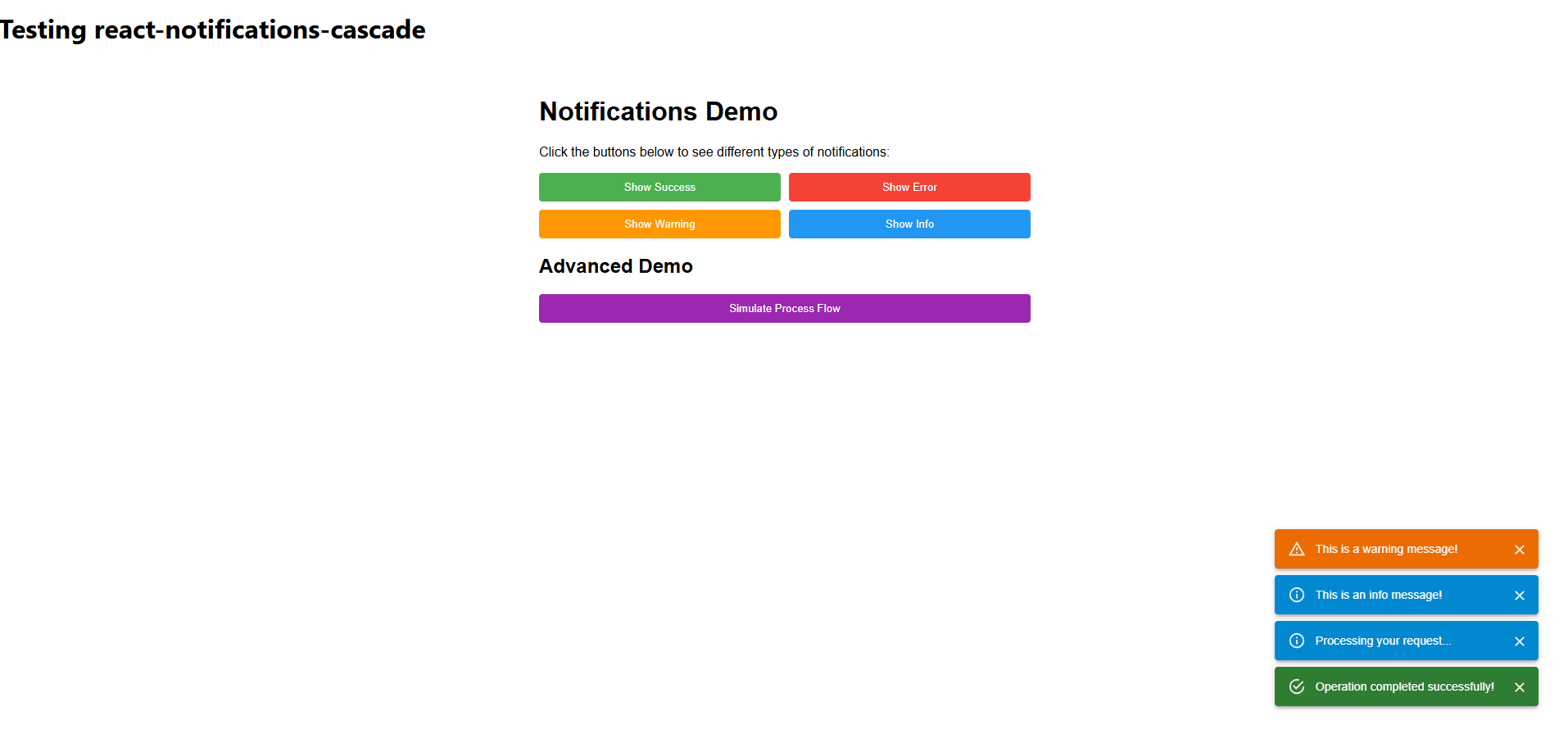
Demo
Installation and Setup
Getting started with react-notifications-cascade is straightforward. First, install the package and its peer dependencies:
# Install the main package
npm install react-notifications-cascade

# Install required peer dependencies
npm install @mui/material @mui/icons-material @emotion/react @emotion/styled
Quick Setup in 3 Steps
Step 1: Wrap Your App
import { NotificationsProvider } from 'react-notifications-cascade';

function App() {
  return (
    <NotificationsProvider>
      <YourAppComponents />
    </NotificationsProvider>
  );
}
Step 2: Use in Components
import { useNotifications } from 'react-notifications-cascade';

function MyComponent() {
  const { showSuccess, showError } = useNotifications();

  const handleSuccess = () => {
    showSuccess('Operation completed successfully!');
  };

  return <button onClick={handleSuccess}>Save</button>;
}
Step 3: That’s it! Your notifications are ready to use.
Advanced Implementation Examples
Form Validation with Error Notifications
One of the most common use cases for notifications is form validation feedback:
import { useNotifications } from 'react-notifications-cascade';

function UserRegistrationForm() {
  const { showSuccess, showError, showWarning } = useNotifications();

  const handleSubmit = async (formData) => {
    try {
      // Validate required fields
      if (!formData.email || !formData.password) {
        showWarning('Please fill in all required fields');
        return;
      }

      // Submit to API
      await registerUser(formData);
      showSuccess('Account created successfully! Welcome aboard!');

    } catch (error) {
      if (error.code === 'EMAIL_EXISTS') {
        showError('This email is already registered. Try logging in instead.');
      } else {
        showError('Registration failed. Please try again later.');
      }
    }
  };

  return (
    // Your form JSX here
  );
}
API Integration with Loading States
Combine notifications with API calls for comprehensive user feedback:
function DataManager() {
  const { showSuccess, showError, showInfo } = useNotifications();
  const [loading, setLoading] = useState(false);

  const syncData = async () => {
    setLoading(true);
    showInfo('Syncing data...');

    try {
      await apiClient.syncUserData();
      showSuccess('Data synchronized successfully!');
    } catch (error) {
      showError(`Sync failed: ${error.message}`);
    } finally {
      setLoading(false);
    }
  };

  return (
    <button onClick={syncData} disabled={loading}>
      {loading ? 'Syncing...' : 'Sync Data'}
    </button>
  );
}
Customization and Theming
Adjusting Auto-Dismiss Duration
The default 5-second auto-dismiss can be customized by modifying the timeout in your notification functions:
// Custom notification with longer duration
const showLongNotification = (message) => {
  const id = addNotification(message, 'info');

  // Override default timeout
  setTimeout(() => {
    removeNotification(id);
  }, 10000); // 10 seconds instead of 5
};
Styling with Material UI Theme
Since react-notifications-cascade uses Material UI components, you can customize the appearance through your Material UI theme:
import { createTheme, ThemeProvider } from '@mui/material/styles';

const theme = createTheme({
  components: {
    MuiAlert: {
      styleOverrides: {
        root: {
          borderRadius: 12,
          fontWeight: 500,
        },
        filledSuccess: {
          background: 'linear-gradient(45deg, #4caf50, #66bb6a)',
        },
        filledError: {
          background: 'linear-gradient(45deg, #f44336, #ef5350)',
        },
      },
    },
  },
});

function App() {
  return (
    <ThemeProvider theme={theme}>
      <NotificationsProvider>
        <YourApp />
      </NotificationsProvider>
    </ThemeProvider>
  );
}
Performance Optimization Tips
1. Memoize Notification Functions
import { useMemo } from 'react';

function OptimizedComponent() {
  const { showSuccess, showError } = useNotifications();

  const handlers = useMemo(() => ({
    onSuccess: () => showSuccess('Success!'),
    onError: () => showError('Error occurred'),
  }), [showSuccess, showError]);

  return <ExpensiveChildComponent {...handlers} />;
}
2. Debounce Rapid Notifications
import { debounce } from 'lodash';

function useDebounceNotifications() {
  const { showError } = useNotifications();

  const debouncedError = useMemo(
    () => debounce((message) => showError(message), 1000),
    [showError]
  );

  return { showError: debouncedError };
}
Accessibility Best Practices
Screen Reader Support
The component automatically includes proper ARIA attributes through Material UI’s Alert component:
// The component automatically includes:
// role="alert"
// aria-live="polite" for info/success
// aria-live="assertive" for error/warning
Keyboard Navigation
Users can dismiss notifications using the keyboard:
// The close button is automatically keyboard accessible
// Press Tab to focus the close button, then Enter or Space to dismiss
Comparison with Other Notification Libraries
| Feature | react-notifications-cascade | react-toastify | react-hot-toast |
|---|---|---|---|
| Material UI Integration | ✅ Built-in | ❌ Separate styling | ❌ Separate styling |
| TypeScript Support | ✅ Full support | ✅ Full support | ✅ Full support |
| Animation Quality | ✅ Material UI animations | ✅ CSS transitions | ✅ Custom animations |
| Bundle Size | 🟡 Medium (with MUI) | 🟢 Small | 🟢 Small |
| Customization | ✅ Theme-based | ✅ CSS-based | ✅ API-based |
| Learning Curve | 🟢 Minimal | 🟡 Moderate | 🟢 Minimal |
Real-World Use Cases
E-commerce Applications
function ShoppingCart() {
  const { showSuccess, showError, showWarning } = useNotifications();

  const addToCart = async (product) => {
    if (product.stock === 0) {
      showWarning('This item is currently out of stock');
      return;
    }

    try {
      await cartService.addItem(product);
      showSuccess(`${product.name} added to cart!`);
    } catch (error) {
      showError('Failed to add item to cart');
    }
  };
}
Dashboard Applications
function AdminDashboard() {
  const { showInfo, showSuccess } = useNotifications();

  useEffect(() => {
    const interval = setInterval(() => {
      checkSystemHealth().then(status => {
        if (status.newAlerts > 0) {
          showInfo(`${status.newAlerts} new system alerts`);
        }
      });
    }, 30000);

    return () => clearInterval(interval);
  }, [showInfo]);
}
SEO and Performance Benefits
Bundle Size Optimization
react-notifications-cascade is designed to work efficiently with modern bundlers:
- Tree Shaking: Only imports used Material UI components
- Code Splitting: Can be loaded asynchronously with React.lazy()
- Peer Dependencies: Avoids duplicate libraries in your bundle
Core Web Vitals Impact
- CLS (Cumulative Layout Shift): Fixed positioning prevents layout shifts
- FCP (First Contentful Paint): Lazy loading doesn’t block initial render
- INP (Interaction to Next Paint): Smooth animations don’t block the main thread
Migration Guide
From react-toastify
// Before (react-toastify)
import { toast } from 'react-toastify';
toast.success('Success!');
toast.error('Error!');

// After (react-notifications-cascade)
import { useNotifications } from 'react-notifications-cascade';
const { showSuccess, showError } = useNotifications();
showSuccess('Success!');
showError('Error!');
From Custom Implementation
If you’re migrating from a custom notification system:
- Replace Context: Use NotificationsProvider instead of your custom context
- Update Hook Usage: Replace your custom hook with useNotifications
- Style Migration: Convert CSS styles to Material UI theme overrides
- Animation Updates: Remove custom animation code (handled automatically)
Troubleshooting Common Issues
Issue: Notifications Not Appearing
Solution: Ensure NotificationsProvider wraps your component tree:
// ❌ Wrong
function App() {
  return <ComponentUsingNotifications />;
}

// ✅ Correct
function App() {
  return (
    <NotificationsProvider>
      <ComponentUsingNotifications />
    </NotificationsProvider>
  );
}
Issue: Styling Conflicts
Solution: Use Material UI’s sx prop or theme overrides instead of CSS:
// ❌ Avoid global CSS
.MuiAlert-root { background: red; }

// ✅ Use theme overrides
const theme = createTheme({
  components: {
    MuiAlert: {
      styleOverrides: {
        root: { background: 'red' }
      }
    }
  }
});
Future Roadmap and Community
The react-notifications-cascade project is actively maintained with planned features including:
- Position Customization: Top-left, top-right, bottom-left options
- Sound Effects: Optional audio feedback for notifications
- Batch Notifications: Grouping similar notifications
- Persistence: Option to save critical notifications across sessions
- Advanced Animations: More transition options and effects
Contributing
The project welcomes contributions! Whether it’s bug reports, feature requests, or code contributions, the community involvement helps make the library better for everyone.
Conclusion
React notifications don’t have to be complicated. With react-notifications-cascade, you get a production-ready, beautiful notification system that integrates seamlessly with Material UI and follows React best practices. The component handles the complex parts—animations, positioning, auto-dismissal, and accessibility—while providing a simple, intuitive API for developers.
Whether you’re building a simple blog or a complex dashboard application, proper user feedback through notifications is essential for a great user experience. By choosing react-notifications-cascade, you’re not just adding notifications to your app; you’re implementing a comprehensive feedback system that your users will appreciate.
Ready to Get Started?
Install react-notifications-cascade today and transform how your React application communicates with users:
npm install react-notifications-cascade
Your users will thank you for the improved experience, and you’ll appreciate the clean, maintainable code that comes with a well-designed notification system.
Have questions or suggestions? The react-notifications-cascade community is active and welcoming. Check out the npm package, contribute to the project, or share your implementation stories with fellow developers.
